Iron
Zine | 2021 | Illustration, Publication Design
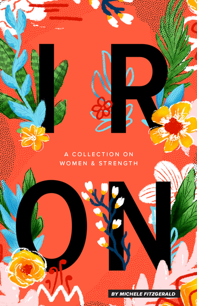
IRON is a zine created to explore the subject of physically strong women and how strength empowers them.


Antiquated gender norms typically portray the ideal woman as "soft, meek quiet" or something to be protected; a damsel in distress. This zine contains essays from several women challenging that notion and telling their own personal stories of how being physically strong is something to be celebrated, not negatively comment on. Additionally, it contains recipes and other bits of useful-and empowering-information.
Design Elements
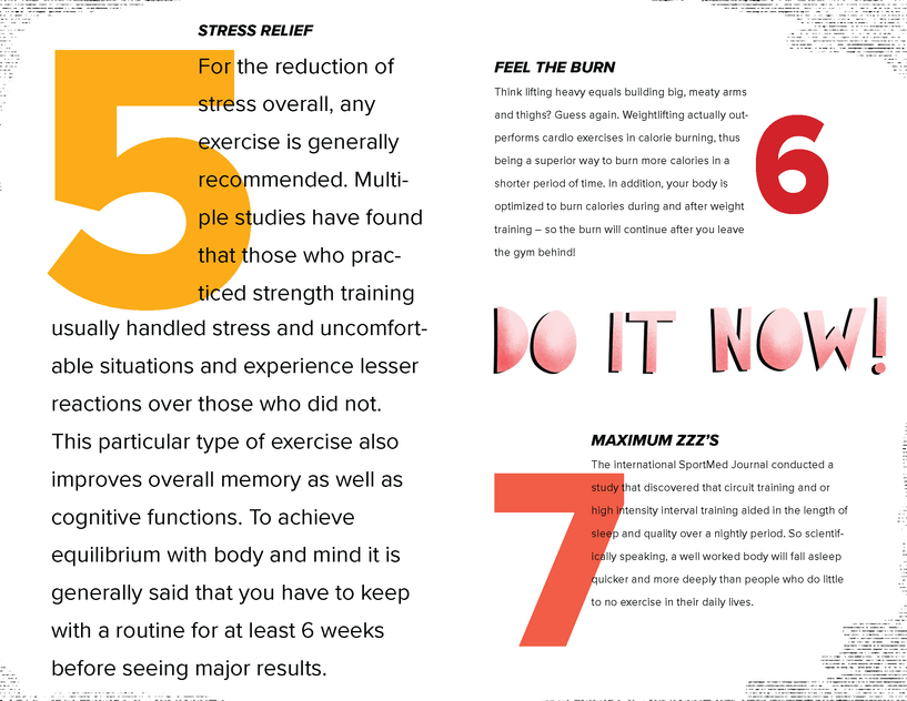
The defining elements of the zine were chosen to push the aspects of the feminine and masculine relationship. The set type is a hard, solid san self that is juxtaposed with he soft, feminine drawing and organic hand drawn type. This is a visual nod to the notion that women are both hard and soft, strong and nurturing.

Concept + Design
Each spread was hand drawn with pencil and paper - then scanned into the computer for refinement & later typography.

Illustration
Illustrative elements were heavily utilized throughout IRON.
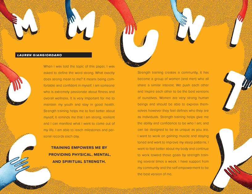
Each excerpt from the zine has accompanying illustrated elements that directly correlate and reference the written material.
Hand Drawn Type
The illustrated typography is intended to reflect femininity + softness.
This is meant to show the duality of women when paired with a modern and rigid san serif typeface.


